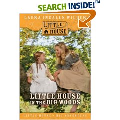

The publisher of the "Little House" series is ditching the old cover art and replacing it with pictures of models posing as the characters in the series.
"Girls might feel the Garth Williams art is too old-fashioned," says Tara Weikum, executive editor for the "Little House" series. "We wanted to convey the fact that these are action-packed. There were dust storms and locusts. And they had to build a cabin from scratch." (The new tag line: "Little House, Big Adventure.")Kids these days.
Publishers are altering cover art—often tied to anniversaries and movies—to appeal to kids weaned on videos and computer games. The thinking is that children are more likely to pick up "Charlotte's Web" with Dakota Fanning on it than with Williams's illustration of a girl and a pig, or Newbery winner "Bridge to Terabithia" with a scene from the Disney movie (in theaters next month). "A Wrinkle in Time" is getting two different new covers. "Purists are often upset. But this is also a way for publishers ... to beef up sales," says Diane Roback, children's editor for Publishers Weekly. "The book jackets we as adults are accustomed to seeing, and love from our childhood, may look musty and dusty to today's kids." Allison Edheimer, 9, wants the photo version of the "Little House" series. "I'd rather read something where I can picture the person," she says. Rachael Ross, 10, agrees: "I like seeing real people better than drawings," she says. "Drawings look sort of fake."
I always liked the cover art because it was old-fashioned--it seemed to promise an entry into a different world. The new covers make it look as though the books are a tie in to an after-school special. Of course, it could be worse: The covers could feature scenes from the old TV show, which was an abomination.
No comments:
Post a Comment